I've had the Apple Watch since it launched and it's now a glorified accessory. The utility is marginalized and it's 100% because of software design decisions.
- It does too much. You wouldn't think this would be a problem but a common issue and one certainly repeated on the Watch.
- Fitness tracking, for example, is fantastic in concept, but it requires too much interaction and prompting to track activities properly. The feature that reminds me to stand informs me when I'm standing. The fitness app on the iPhone isn't very helpful either.
- Siri never detects my voice correctly. Half the time that it does it asks me to pull out my phone anyway to view results.
- The friends/button is useless (I do have friends) but the ones that have an Apple watch, never use it. IMessage drawing is fun exactly three times. It gets old fast.
- The UI to launch apps is totally unusable. A hexagonal grid on a tiny device with no labels? What is going on?
- Even the buying experience of an Apple Watch was very un-Apple. It's confusing. There are three models, two sizes and 5-10 choices of bands per style.
- ApplePay got wiped from my watch when I upgraded to Watch OS 2.0. The fact that it doesn't sync with the phone is absurd. The cryptography to do this type of secure exchange does exist.
- Don't get me started on what it's like to try to take a phone call on your wrist. The short story is that I didn't feel like Dick Tracy.
Apple knows how to do this
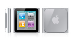
The iPod Nano (6th Gen) was tiny. It did a few things well and it didn't try to do too much. It had a touch interface and it had pre-built apps. It certainly wasn't perfect but Apple had a template for what worked on a small screen. The four key features are front and center. Everything else is a swipe away.
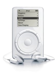
Going even further back, Apple has been working on small device screens for years:
The original iPod was a very simple and usable interface. It's screen dimensions, in terms of resolution, was similar to the Apple Watch. The click-wheel resembles the UI metaphor of the wheel on the watch perfectly.
How can Apple Fix it?
To fix this the next Gen Watch needs three things:.
- Better app launcher / navigation. Much simpler.
- Better UI performance, especially around telling the time and Siri
- Less emphasis on everything except Music and Fitness.

