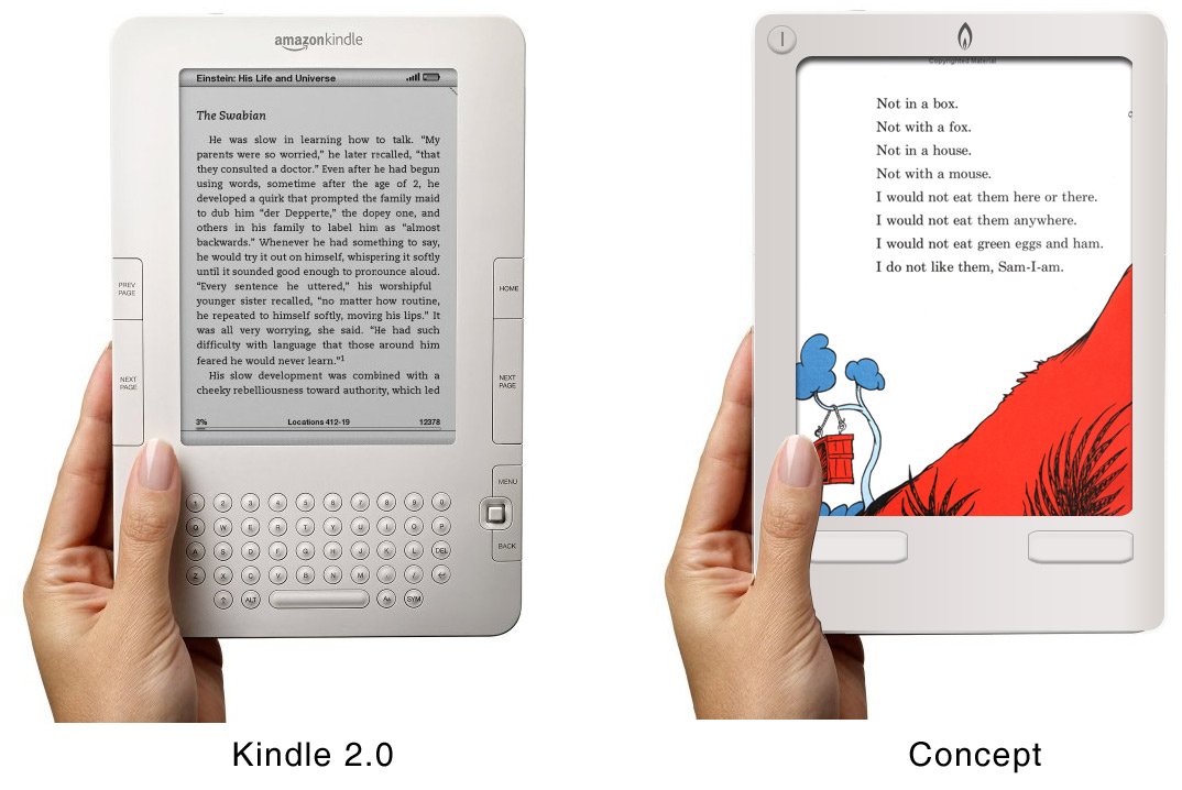
While the technology is amazing and the concept of an e-Book reader is great, the actual design of the Kindle and its second version is still pretty bad.
The core scenario is reading content, and the design doesn’t reflect this. The design has too many bells and whistles and not enough elegance to be a truly great device.
- A keyboard has no business being in a book. It clutters the hardware and takes away space from your content. It’s about consuming content, not creating it.
- The device needs to be touchable. If you’re going to offer any type of interaction with the pages and content, you need to be able to touch the screen to turn the page and tap menus.
- The design should be more anthropomorphic (human-like) both in look and interaction. It needs to feel less mechanical and more natural.
- It needs to properly render the design intentions of the typographers and publishers that created physical books. Things like hyphenation aren’t just pretty; they help readability. The book content comes first.
- Black and grey, really? This is an example of a compromise in the design. The readability, functionality, and user experience suffer because someone decided that it needed to use e-ink. This technology is cool, but its performance and color contrast are still not as good overall as a color screen. Yes, you can use it outside, but a design that sucks inside still sucks outside. Plus, you can’t read it at night without a secondary light.
My proposed design:
- Three buttons: on/off, next page, previous page. Everything else is touch screen (including a touch keyboard when needed).
- Color screen design allows for better web and book reading.
- Screen takes up 80%.
- Typography and graphics are rendered as the author intended.
- No menu/Wi-Fi/battery indicator. It’s a book. Tap the screen to see menu/status info/options.
