Dangerous Features
Dangerous Features
This is a screenshot of the menu bar in office being docked to the left side of the window.
You may ask, why would someone want to do that? The short answer is that they probably wouldn't. The long answer may have something to do with Far East languages that read top to bottom. In short I don't know why this feature exists in the english version of Office but I'm pretty sure it's a bad feature.
What makes a bad feature?
- The feature can be turned on by accident
- If the feature is turned on there's no obvious way to turn it off
- The number of people who use the feature is small, and the number of people who absolutely need the feature is close to zero.
- The feature is asthetic but can cause functional errors
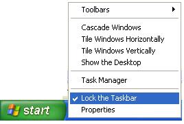
When working on Windows XP the usability team discovered a similar problem in Window 98-2000. The problem was that users would click-drag the taskbar when they thought they clicked on a program icon. This would either cause the taskbar to shrink to be a tiny pixel bar at the bottom of the screen or it would accidently get dragged to take up 1/2 the entire screen.
The solution was to keep the taskbar locked by default:
Advanced users would be able to unlock the taskbar and resize it to their hearts content but beginners wouldn't drag the taskbar into oblivion.
Think about your own software, are there any dangerous features? Have you protected your users from mistakes?

Comments powered by Disqus.