The power of a brand
I recently watched an interesting piece by Jared Spool on branding and how branding can influence and impact the user experience. The basic overview is good and fascinating to watch but I think that he misses an opportunity to teach people about how to create great user experience brands and then use them in design.
A brand isn't just a design element it's a personification. The brand represents a physical person whose name is the same as the company it represents. Every experience you have with a brand helps reinforce that experience. A good brand experience uses, sight, sound, and touch to create a complete experience.
- The Staples brand of "that was easy" extends to the store experience. There are people who now go and buy "easy buttons" for the fun of it. Now that's a branding.
- The NetFlix brand experience extends to the envelope design and online experience. The envelope is designed with a tear-off portion that can easily be handed to a friend.
- The Tivo brand experience extends to the audio design and iconic figure.
Back in 2000 when I was working at Microsoft we were thinking about how to re-brand Windows. The OS was seen as boring, dull, grey and many other negative attributes. We wanted to introduce a new windows brand that was fun, colorful & inviting. To do so we needed to match the user experience so that the brand would hold true and replace the perceptions.
Rob Girling the design manager of windows at the time created a basic map outlining the design spectrum. On one axis was Whimsical and Practical. On the other axis was Natural and Mechanical. We used this tool to figure out what direction we wanted to move in terms of the brand and the supporting pieces. We determined that we wanted to be more in the upper right and that the OS was seen in the lower center. Using this graphical tool we were able to explore the design alternatives to see if they helped move us in the right direction.
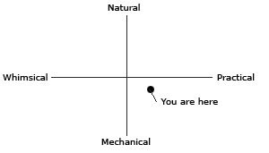
Similarly, this tool can be used for other types of brands. If you can figure out where you currently are in terms of the brand you can then figure out what direction you want to move.
There is no right or wrong on this graph. Some companies and brands choose to be natural and whimsical (Google, Yahoo, Tivo) and others choose mechanical (Cisco, IBM, Oracle.)
To create a great brand you figure out the location where you want to be on the brand map and then you re-enforce that location with everything you do. For example, it would be out of character for IBM to place an April fools joke on their home page but this type of Whimsical action is something you come to expect from Google.
The symbol of the brand also reinforces that personality. Bright alternating colors is likely whimsical. Strong solid lines with lots of sharp angles make things look mechanical or practical. Flowing lines and shapes make elements appear more natural.
Before you focus too much on the logo figure out the personality you want and then ensure that your logo, online experience, and end-to-end process reinforces those elements. Now you're branding not just a logo but a company culture.
Comments powered by Disqus.