Designing navigation - GitHub
This post explores a design simplification on GitHub.com. The aim is to explain the process of a UI redesign and how aspects of UI can be consolidated and simplified.
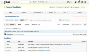
This example is a typical project page. There are a little over 40 navigation elements in the before image. (buttons, tabs, links, etc.) This UI can be difficult to manage. The primary problem is both clutter and context. To begin to simplify the navigation structure we need to understand the elements on the page and the core uses of the site.
One key principal I use:
Each page should have a key purpose. The UI should be optimized around that key purpose and extraneous things should be moved or removed when possible.
With this in mind I would say that the purpose of this page in GitHub is to browse source code. It serves a number of other purposes but it's core use should be to explore code.
I've broken the navigation out into core actions. It's important to group actions, buttons and links by logical area, and not by the location that it currently appears.
Global Context - (Actions that operate with no context)
- Explore - explore the site
- Gist - a clipboard system using git
- Blog - news from GitHub
- Help - documentation and information
- Search - global
- My personal profile
- Create a new repo
- Account settings
- Logout
Repo Context (Actions that impact the current source repo)
- Clone
- Download Zip
- Change branches
- Sub-navigation within repro: Commits, tags, downloads, wiki, graphs, etc.
- Search code
- Browse code
- Code History
In thinking about navigation I tend to start from the top and move down. The first part is identifying the core navigation and tasks on the page.
The likely actions are interacting with your personal account or performing a search. The blog, explore and create repo actions are not core to the daily interactions.
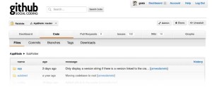
- I removed the icons from the navigation and replaced them with text. This is done in other areas of github and works well. Icons are nice if you know what they represent but can be confusing otherwise.
- I consolidated account inbox and dashboard. Both areas represent a way to update you on what has changed recently. There's no good reason to have both.
- I removed the advanced search glyph. I expect users should try a basic search before feeling the need access advanced search options. The default search should be to search code within your own repos. Search my stuff first, give me the option to search everything on the results page.
- I removed the global navigation. Elements like the blog are not core to the daily use of the site and can be relocated in the footer or other company information pages.
Now for the hard part...
- Working down the page I wanted to simplify the project navigation and unify it with "Branch" navigation. Conceptually a branch is a high level context switch. Even if other sections are not contextually aware of the branch it's better to have the higher level switch and allow for such context aware behavior in the future.
- I've removed many of the buttons including: Pull, Fork, Zip, Code %, etc. These appear to have accumulated over time. It makes sense that there would be a "dashboard" tab that could contain this and other non-code things like the ssh/http cloning URLs. It's sufficient to have a "clone" button that could reveal much of this secondary UI. Such a project dashboard would naturally also have the default "ReadMe" for a project and provide a jumping off point for more esoteric features.
- The tabs containing File, Commits, Branches are tertiary navigation. I've moved them under the secondary navigation and matched the selection and tab styles to show the visual relationship. In the current design Tags and Downloads were arbitrarily right aligned. Pulling these in cleans up the look & feel.
- As noted before Search was pulled up into a global context.


Comments powered by Disqus.