Explorations in Firefox UI
I few months ago I was contacted by the folks at Firefox to do some visual explorations for Firefox 2.0. Although we where only officially doing visual explorations we did take some extra time to do a bunch of interesting concept explorations for the user interface.
The look and feel for Firefox 2.0 was done by Radiant Core and is a clean and familiar look. I'll be writing about some of my own explorations more from the UI side in this three part series.
- Initial thoughts and explorations
- Office 2007 Style UI in a browser
- The Future of web chrome and browsers
When creating the initial UI explorations I followed a basic philosophy for the types of conceptual changes that should be made.
- Keep things familiar. Existing users of IE and Firefox should feel comfortable using the UI. Don’t get rid of the steering wheel, but do add heated leather seats.
- Design for the business. The interface needs to appeal to business users to gain market share in corporate deployments. Firefox is reaching the limits of tech enthusiasts and needs to embrace the business customers and corporate deployments to continue to gain market. Using blue colors and metallic colors help the interface look more business.
- Don’t follow, be the leader. Continue to push the envelope with new ideas and new technologies that make the browser experience both different and better. .


- This split control control is typically used to show details of the browser history. Typically this is shown as a drop down. Instead you could improve the history experience and allow users to visually see their navigation using thumbnails:
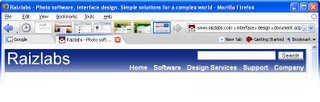
Thumbnails would be shown within the toolbar, sliding the other buttons out of the way. Users could continue to navigate as normal in this mode seeing a visual representation of their navigation. The very first icon within this mode would display the browser history. -
The second area would be used to promote bookmarks and make this area easier to access. The Bookmark menu would still be there but mainly for historical purposes, the command button and item #7 would be the primary access points for bookmarks, more on this concept later.
-
The close box would be on the individual tab and the tab would have a fixed width size relative to other tabs. Tabs could adjust their width when new tabs are added but would stay the same width as tabs are removed. This would make it easier to close multiple tabs quickly. By default tabs would share space with the toolbar links #6. Toolbar links could be moved/customized or get their own line as needed.
-
There are several problems with URL's/URI's and several ideas to address these problems.

- URL's get too long making it difficult to copy/paste
- URL's get used to pass form data (that users don't usually need or understand)
Many of these issues can be addressed:
- Remove the protocol leader for the protocols “http” and https.” Secure URL’s would still use a lock and yellow colors to show secure sites. These would be implied, users could still type them but they would be hidden. This would shorten the URL and make it more obvious that this portion of the URL does not need to be typed.
- Slashes would get converted to arrow glyphs. This is partly aesthetic but it also helps communicate that folders invoke a change in context. It would also help with auto-completing URL's...

- One pretty big problem with URL’s is trying to type in a long URL. History can auto-complete the URL if you’ve been there before but what if you haven’t been there? The idea here is to introduce a technology I’m calling Simple Site Maps (SSM’s). A simple site map is an XML document that defines peer and child URL’s at any level within a site. This is very similar to Google Site Maps technology. The idea would have to be fleshed out but it would allow two things. 1) It would help search engines properly index and find site nodes by their logical structure. 2) It would allow users to auto-complete URL's and even domain names as shown above.
- Anything after a normal URL question mark would get shown as a little document icon. This makes URL’s friendlier. If you did a copy paste on the URL you would still get the whole URL. You can also click on the document to expand the data in-place. This makes it easier to deal with the ridiculously long URL’s that are now commonplace.
- In this area I’ve combined three buttons that are mutually exclusive. The Stop, Refresh and Go buttons are combined into one. If the user is typing a URL the button says “Go.” While the site is loading the button says “Stop.” After the page is loaded the button changes to “Refresh.” If the user starts typing a URL again the button returns to “Go.”
Next to the Refresh/Go button I’m showing a Google logo for the Search box. Currently Firefox uses a 16 pixel icon for each search engine. Although this is compact it wouldn’t necessarily communicate the search engine brand as quickly to non-technical users. If this field gets sized particularly small it could revert to the 16 pixel version. The search box also has a combo-box option. The thinking on this is that it would allow the search engine to display search history, suggestions or something similar. This would allow search engines to differentiate by providing things like Google suggest.
- The new tab button would always be in a consistent location and its function would be obviously labeled. If there where lots of tabs open only the icon would be shown.
The bookmark button would make it really easy to add bookmarks either to the toolbar or to the general bookmark manager:
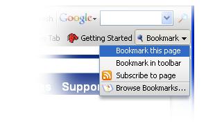
The options allow you to bookmark the page. The second option allows you to easily bookmark into the toolbar without using drag and drop. The third option allows you to subscribe to the page using RSS but without using techno-jargon to explain the concept. The last option brings you to the bookmark manager. This is the same as the toolbar button #2. If a page has already been bookmarked you would get additional options in this menu. These additional options would be “Remove Bookmark” and “Edit Bookmark.” This would allow users to edit or remove bookmarks without needing to know how to right click.
In the next article I'll explore the concept of using Office 2007 style ribbon UI as a browser interface.
Comments powered by Disqus.