Interface List Design - Drupal
This is a quick UI critique on a list design pattern that's in a proposed stages for Drupal7. The UI being critiqued is not final, as such the feedback is meant to be helpful to both the Drupal team and anyone else designing list based design patterns.
Before:
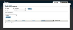
[caption id="attachment_465" align="alignnone" width="300" caption="Example image from drupal 7 content list"] [/caption]
Key points with this screen:
- The title areas don't tell you what you're supposed to do on this screen. In fact there are at least three competing title areas. "Content" as a title, "Content" as a tab, "Add new content" as a secondary title and two group boxes that cover filtering and updating. The actual title of the screen doesn't reflect the modal nature of dialog. You're actually adding content to something else and it's not clear what that is.
- The information is presented in the wrong reading order. The content table should be first. You first have to read the list to see what you're dealing with before you decide to either filter it or update it.
- An empty list is a dead-end. It tells you there is no content but doesn't direct you on how or where you should go to create some.
- The X in the upper doesn't make it clear what it would close. The tab? The dialog? A simple cancel button or a standard cancel button or a close button in the upper right would be more obvious.
After
Key points
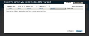
- Title should say what you're doing.
- Filters should sit above column headers whenever possible. No additional button action should be needed and multiple filters can be applied at the same time.
- It should be easy to reset the filters and hide them. Hidden should be the default. The filters should give you a clue as to the number of items in each filter bucket: Articles (3) Posts (120). This makes it easier to select the right filters.
- If the table is empty it should be easy to get to a content creation page.
- Buttons along the bottom of a dialog provide clear ways to exit or complete the task.
- Things that don't map to the core task should be hidden. In the original mockup there were options to update the status of content from published to unpublished. This type of functionality belongs in a management section, not when you're "adding content." It should be removed or hidden in a similar way that filters can be hidden.
This post is licensed under
CC BY 4.0
by the author.

Comments powered by Disqus.