Pixel Pushing: FourSquare
This is the first in what I hope will be a series showing basic UI explorations and critiques of various user interface screens, with a focus on mobile applications.
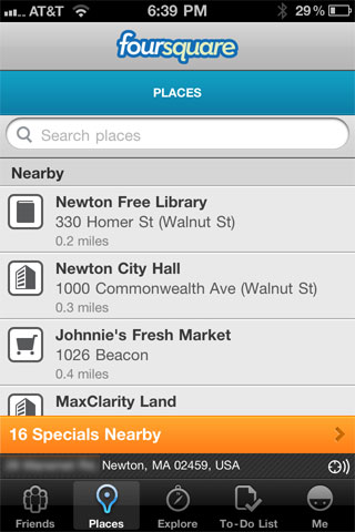
The screen I'm starting with is the FourSquare Places screen. The purpose of the screen:
- Allow users to select a nearby place
- Search for places if the place is not in the list
- See potential specials and nearby promotions.
Issues I spotted with this screen.
- Branding in the title bar. While this may be OK in a key screen it's unnecessary on every screen and takes up valuable space.
- Because of the branding problem we have a secondary title bar that describes the page. This is useful as it confirms the page however the text is ALL UPPERCASE and too small.
- The search toolbar is fine except it's not vertically centered in its bar.
- The list is three lines where the first line is the venue name, the second line is its address and the third is the distance from the venue. This can be collapsed into two lines while increasing the font size.
- There are two bars across the bottom (apart from the tab-bar). This is problematic as it eats valuable list space and it can cause problems as it's hard to tap items at the bottom of the screen without accidentally changing tabs.
Quick re-design:
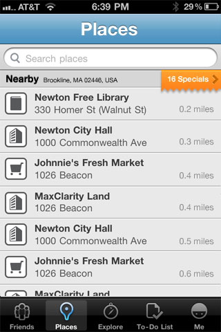
- I've removed the logo from the screen. I think a proper title bar is stronger.
- I've centered out the search bar. Additionally the search bar can be hidden by default as it is in the "Notes" app.
- I've moved the nearby text into the Nearby header bar. Logically this information is connected so it makes sense together. The GPS icon has been removed as it serves no obvious purpose.
- I moved the specials up so that they were logically "Nearby." This meant the extra text wasn't needed. Moving this up from the bottom and adding the ribbon effect encourages interaction. The placement should make it easier to tap and since both the table-header and the specials float above the table we're not loosing any extra vertical space.
- I've simplified the table-cells to two lines by moving the distance value into its own column. This should also aid in scanning locations based on distance.
- The design changes allow a single page to display 6.3 items, the original allows you to view 3.5 items at a time. An improvement of 80%.
This post is licensed under
CC BY 4.0
by the author.


Comments powered by Disqus.