Legibility and Readability
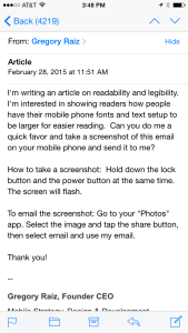
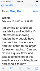
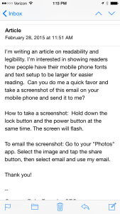
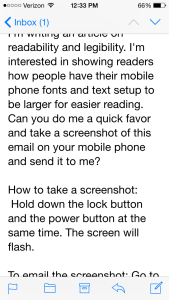
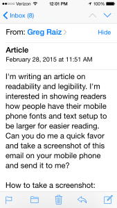
Most designers take readability for granted. It's easy to assume that people have a similar perception, but the reality is that our eyes are as different as our personalities. As a quick experiment, I sent an email to some friends and family to see how they typically read their emails.
Designer late 30's
Female 60's
Female 60's with Lasik
Male 70's
Male 60's
There were some things that I found fascinating:
- Everyone had a different font-size. Some are close, but they are all different.
- Dynamic text isn't often discussed in design circles, certainly not as often as responsive design. Both are meant to accommodate the user's perception.
- The designer's eye-sight was significantly better than everyone else's, not surprising perhaps.
- The designer in their late 30's has over 4218 unread emails; that's a topic for another post.
Key points from Apple, on font sizes:
- Text should never be smaller than 11 points
- The body style default is 17 points
- The headline and body styles use the same font size. To distinguish it from the body style, the headline style uses a heavier weight.
- Text in a navigation bar always uses 17 points, which is the same as the body text style at the large setting.
- Text always uses either regular or medium weight; it doesn’t use light or bold, because light and bold weights don’t read well at small sizes.
Read more in the Apple Human Interface Guidelines
What does Google have to say about font sizes?
- The basic set of styles are based on a typographic scale of 12, 14, 16, 20, and 34. Type is defined by "Scalable Pixels" that can become bigger to accommodate accessibility.
- Text should maintain a minimum contrast ratio of at least 4.5:1 (calculated based on luminance values) for legibility. A ratio of 7:1 is preferred.
Read more in the Google Material Design guide
This post is licensed under
CC BY 4.0
by the author.
Comments powered by Disqus.