Office 2007 UI in Firefox
This is part 2 in a three part exploration of browser interfaces. Initially I started looking at how you could use the current interface metaphor to improve and extend functionality. I then started to reconsider my assumptions.
Part of my initial philosophy was that the next generation Firefox browser should target businesses. If this is true then shouldn't it look more like Office?
While this was an interesting idea it didn't really push the envelope. This skin could be developed but it wouldn't change the metaphor. I had been using Office 2007 Beta for several weeks and found that it offered a good alternative to traditional menus and toolbars. The next step was to consider how this could be applied to a web-browsing.
The nice thing about the Office ribbon approach is that it allows you to create task centric panels associated with high level pieces of functionality. This allows your tools to have context (Something that's done poorly with menus and toolbars).
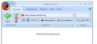
The initial set of ribbon tabs I considered was: Browsing, Bookmarking, History, Tabs and Views.
I mocked up the main browsing structure. This was broken into three logical sections. Navigation, Location and Search.
- The navigation section is first and allows the back button to be larger then the other buttons. This makes it easier to click/use and demotes some of the less used buttons like forward, stop and refresh. You'll notice the back button is also a split button allowing you to get the traditional history.
- The location section shows the URL bar. You could re-use many of the concepts introduces in part 1 to streamline the Url. Underneath this section we have other tools that impact the location. The most obvious is the bookmarked locations but the new concept I'm showing is a top 10 list. Most people visit the same 10 sites every day. This would keep track of those top 10 and make it easier to access. The location bar could also show live micro-summaries like the weather, stock-market or similar quick access location tools.
- The third section is the search box. Similarly this could contain multiple search providers, search on this page, or alternative search mechanisms. Using a full logo instead of just a 16 pixel icon makes it more obvious that this is for entering a search.
The nice thing about the Ribbon approach is that different tabs could have different pieces of functionality.
- If you had "Bookmarking" selected you would have appropriate tools to create bookmarks (tags, labels, folders, search bookmarks).
- If you had "History" selected you would search the history, display thumbnails, etc.
- If you had "View" selected you could change the view to print the page, zoom to fit, text-only, no-images, etc.
- Developers would also have the ability to add tabs and extend functionality. So De.licio.us could either add functionality to the bookmarking tab or create it's own tab.
- Similar to Office you would also have context sensitive tabs. For instance if you had your cursor in an edit box you would get a formatting tab to allow you to style and spellcheck your text. (This way each web-site wouldn't need to re-invent the Office toolbar 1000 times over.)
This particular exploration was the largest departure from the traditional look of a browser. Many of these concepts will likely make their way into a browser as the traditional menu/toolbar make way for the task based Ribbon.
Traditional applications are trying to be more web-like adding network aware features and online functionality. At the same time web-tools are becoming more like traditional applications adding AJAX and other real-time interactions. As the web-platform continues to mature this line will continue to blur.
More on the Future of web chrome and browsers in part three. Stay tuned.


Comments powered by Disqus.