Building a better Digg Design
Many web designs have too much unorganized stuff on the screen. Much of this stuff is usually useful in some way but it's unorganized and leads to a confusing page flow.
When you read a book you have a very simple page flow. You start at the upper left hand corner and you scan across and down till you reach the end of the page. This basic flow remains similar when people read read magazines, newspapers and web-pages as well.
Page flow can easily be altered by objects that grab your attention. These can be images, columns or text. These attention grabbers divert your natural flow. Visual blocks encourage the users eye to jump around the page until it stops on something interesting. The design of these visual blocks is core to how a page will function.
Let's use Digg is a simple example:
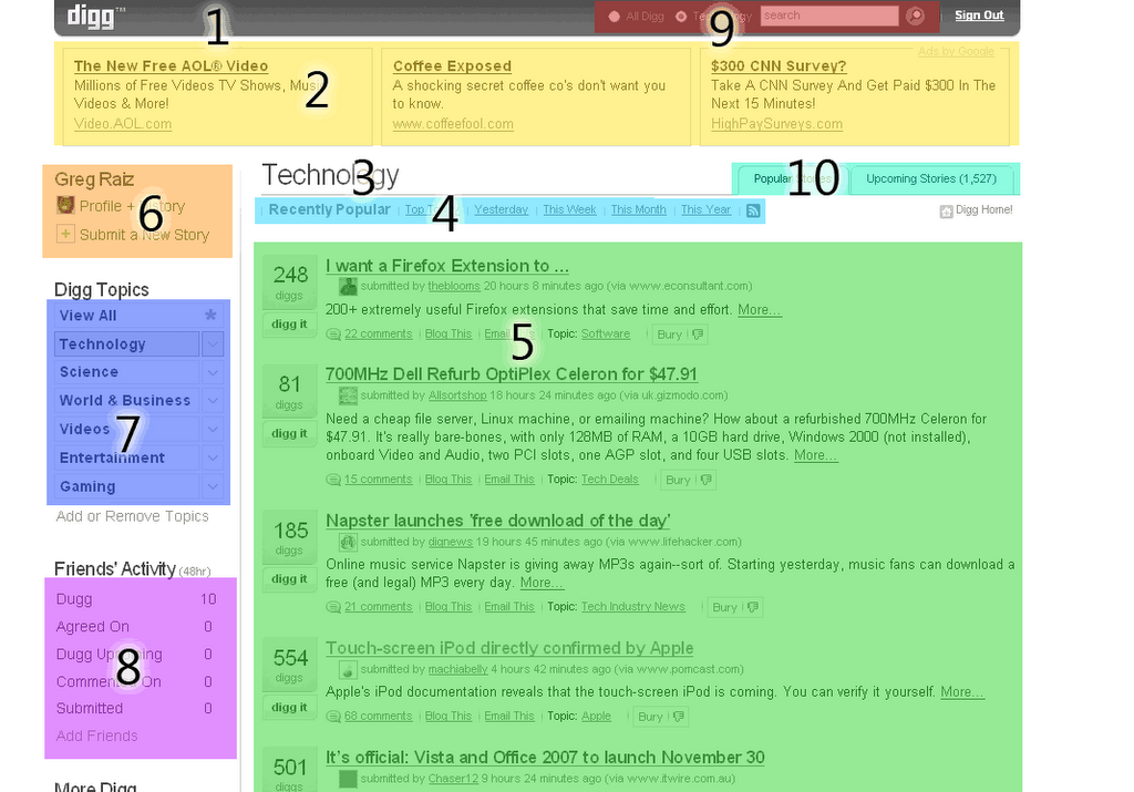
Your eye will generally start at the upper left corner and drift diagonally down to the bottom right looking for things of interest. In this case we start at the logo, drift down the page. Each block of data will be quickly skimmed or ignored. A possible flow could be 1,3,5,6,7,9. Every person will scan the page differently but understanding a basic flow means that you should try to put important elements within the core flow.
The current Digg site places many navigation elements outside the main flow. The "top" navigation is along the left and secondary navigation is sometimes along the top and sometimes along the left. Because the navigation elements are scattered it's harder to browse the site. The flow also decreases ad revenue because the ads across the top will be ignored as people scroll into the content.
I've done a basic mock up to illustrate an alternative flow:

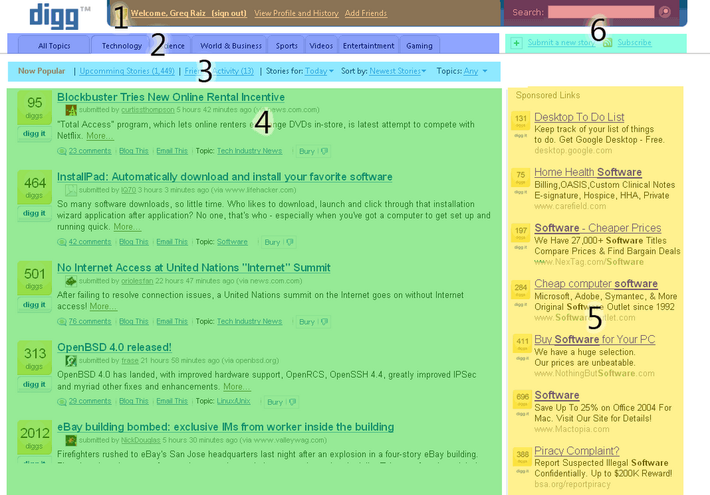
Key Points about the design:
- The logo larger and on a white background. This makes it easy to read and recognize. This also helps maintain brand integrity when people copy the logo and place it in a news article, post or publication. (Don't fight this, help your brand get popular)
- Secondary login information and profile links help users recognize if they are logged in quickly. This is near the top but outside the main flow so if a user scans quickly and misses this it's not a big deal.
- The top most categories are shown as tabs. This makes it easy to navigate between categories and provides consistent placement within the flow. You can't scan down the page without seeing the top categories.
- Many secondary navigation elements have been combined. All these navigation elements are filters and sorts on a possible list of articles. Having all these navigation elements together makes it easier to filter/sort by the appropriate criteria. When similar things are placed together they fit into a single flow block making it easier to parse.
- I've left the main section alone. It could also be tweaked to improve readability but it's pretty good as it is.
- A simple flow also helps the page load fast. (This is currently a problem for the site)
- The ads section is probably most altered. This seems like a place where Digg could do much better then vanilla Google ads. I'm showing a concept where users could Digg-up ads. The section is within the page flow and would scroll similar to the rest of the page. The section is clearly marked as advertising but something like this would generate amazing click-through, revenue and end-user enjoyment.
Comments powered by Disqus.