Google Chrome Browser Review
Google surprised everyone when it recently released a web-browser named Chrome. The surprise was primarily due to the fact that Firefox seemed to be the Google darling for many years. As Google has grown, the dependency on browser technology has also grown.
As a search engine Google primarily displays HTML with some minimal JavaScript. But as an email, calendar, ad-network, blogging platform, news-reader and more, the dependencies on the browser have grown. To alleviate this Google has used projects like Google Gears, Google Toolbar, Google Web Toolkit and more to fill the gaps of the browser. Now it seems the stop-gap solutions are not enough.
First off... Google Chrome is not for everyone. In fact I may even say it's not yet for anyone. It's a Version 1 and it does a lot of things well but it's not perfect and there are still a number of issues that need to get worked out. It also only works on Windows. That said it's a pretty good V1.
Google stands on the shoulders of both Mozilla's Firefox and Apple's WebKit for many pieces of the browser. This could not have happened without open-source software. The primary rendering of pages seems quick and crisp and all pages in my initial testing seemed to work without a problem.
The key areas where the Chrome browser is different:
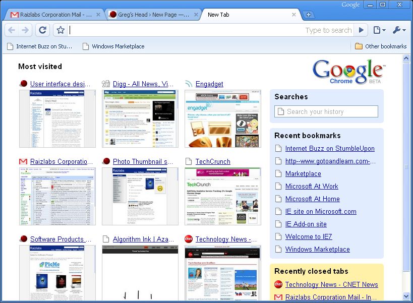
- Opening a new tab
- Auto-completing a URL
- Overall look and feel
- Incognito
- What's missing - Plug-ins, spellcheck, etc.
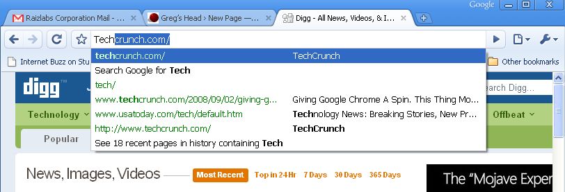
Auto-completing a URL
When you start typing a URL into the address bar Google chrome automatically starts searching your history, your bookmarks and Google itself via Google Suggest. As anyone who's done reasearch on search knows that one of the most common things typed into any search engine is a URL. By combining search and URL's you have one stop shoping for typing a site name, a bookmark or a search. I wouldn't say it's better or worse then Firefox it's just a little different. Some users may appreciate the change while others may find it annoying.
Overall Look and Feel
The overall look is very clean and minimal. It reminds me a lot of Safari on the Mac. The buttons are minimal, there are no draggable toolbars, no hidden menus when you hold Alt, no bookmark manager, no spinning logo, no toolbar customization. The browser does it's best to stay out of your way.
- The find on page dialog floats cleanly within the window
- The download page doesn't get lost in a secondary window
- The status areas comes and goes as you hover over links never stealing space from your overall browser.
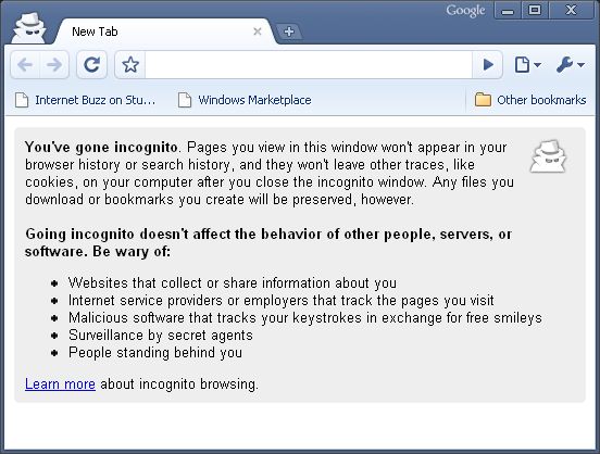
Incognito
In Safari it's called "Private Browsing" in Mozilla there's an extension called 'Distrust' in IE the often talked about but never implemented 'promiscuous mode.' In Chrome the feature is called Incognito aka 'porn mode' creates a seperate window that is free from the browser cache, history or other identifiable data.
I'll just say it's an interesting feature to include considering the other features that have not been included.
What's missing
As I said previously I don't consider Chrome to be a complete browser. There is no bookmark managment, no visible support for plug-ins, no spellchecker, no way to set a home-pages, etc. etc. Some of the tools you depend on may not be available. For some people this isn't a big deal for others it'll be a show-stopper.
The big deal is performance
In initial testing Chrome seems to be significantly faster at rendering complex pages then both IE and Firefox. The difference is visually noticable as pages pop and complex interactive sites like Gmail load with new found speed.
This performance is undoutably one of the key reasons that Google decided to invest in it's own browser. The engine driving Chrome's Javascript is a new peice of technology that does for JavaScript what Java had promissed to do years ago.
The added performance does come as some cost in terms of memory:
Sure it's faster but look at all the memory it's using. 80 megs for a browser is about 4 times what firefox and Internet explorer use. On modern computers memory performance tends to be cheap. Of course you want fast and minimal memory but if you had to choose one I'll take the performance.
Other details
- Chrome has a feature to turn a page into a desktop appication. This is simlar to the Prism concept from Mozilla. This is the future. I was very happy to finally see this in a shipping product.
- There is a development mode that's preety slick. It's not quite Firebug but it's pretty good.
- View Source formats and displays a good looking source page
- Browser settings, bookmarks and other data import nicely
- Spell Check. I miss you.
- Tabs can be 'torn' off similar to Safari to create a new window, tabs can also be re-ordered by dragging.
- The browser passes the Acid-test 2 and does OK on acid test 3 (77/100)
- Accessibility and keyboard shortcuts seem to work well


Comments powered by Disqus.