Quick Calendar UI Review - Google
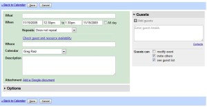
This is a simple UI critique of a simple feature burried in Google Calendar. Here's the original:
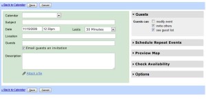
It's a relatively simple form. It's certainly not bad but I think it could be better. Here's a quick mock up:
Here are the key design points:
- The body of the form has "What, When, Where" but doesn't have "Who" if you're having a meeting it stands to reason that the people attending are pretty important. I always felt that having guests hidden in the right didn't make sense.
- The majority of meetings are measured in duration. 30 min, 45 min, 1 hour, 2 hour, all day, etc. It's much easier to pick a common duration and allow "custom end time." as a fall-back rather then making users select end times.
- Most meetings don't repeat. Logically this is a secondary consideration. This can be moved to the secondary area on the right.
- Checking availability should be a secondary area action as well. Plus over on the right there's more space to present availability in-line.
- It should be really easy to preview a location with a map.
- The current UI makes it difficult to add people to a meeting without the system automatically emailing them. You have to place names into the description area. Having a simple checkbox to email guests could solve this.
- There are a lot of simple UI 101 alignment things that can make the UI look cleaner and simpler just by lining fields up.
- The right hand side could be extensible with new modules, plug-ins, ala Google Labs.
This post is licensed under
CC BY 4.0
by the author.


Comments powered by Disqus.