Yahoo's New Logo
The reason the new Yahoo logo works is interesting, but not for obvious reasons.
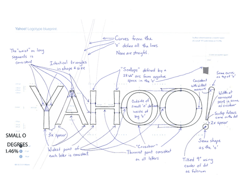
The schematics that Marissa posts on her blog are interesting, but useless. I remember drawing similar sketches during the redesign work for Windows XP.

It's fun to draw guides and discuss justifications about color and angle, but the reality is that you're playing with design elements and they have to look good.
For Yahoo, "looking good" isn't necessarily obvious until you put their brand in context to the places that you see it most often.
The logo is balanced because it leaves a spot for their many sub-brands:

The different size of letters and distortion on the Y and the O makes it look like it's a balloon being blown up. The one schematic line that didn't make it into Yahoo's sketch is the only line that makes this logo work and creates this effect. It's the baseline of the letters:

The logo itself is simple. It is a simple font with a lack of embellishments. It's more sophisticated and certainly a move in the right direction when compared to the original.

Comments powered by Disqus.